Osmo Scaling System
A pure-CSS fluid scaling system using CSS custom properties and clamp(). Sets a --size-font variable derived from the viewport width and design container size, applied to the body font-size so all em-based values scale proportionally across four breakpoints.
Code
/* ------------------------- Scaling System by Osmo [https://osmo.supply/] -------------------------  */

/* Desktop */
:root {
  --size-unit: 16; /* body font-size in design - no px */
  --size-container-ideal: 1440; /* screen-size in design - no px */
  --size-container-min: 992px;
  --size-container-max: 1920px;
  --size-container: clamp(var(--size-container-min), 100vw, var(--size-container-max));
  --size-font: calc(var(--size-container) / (var(--size-container-ideal) / var(--size-unit)));
}

/* Tablet */
@media screen and (max-width: 991px) {
  :root {
    --size-container-ideal: 834; /* screen-size in design - no px */
    --size-container-min: 768px;
    --size-container-max: 991px;
  }
}

/* Mobile Landscape */
@media screen and (max-width: 767px) {
  :root {
    --size-container-ideal: 550; /* screen-size in design - no px */
    --size-container-min: 480px;
    --size-container-max: 767px;
  }
}

/* Mobile Portrait */
@media screen and (max-width: 479px) {
  :root {
    --size-container-ideal: 390; /* screen-size in design - no px */
    --size-container-min: 320px;
    --size-container-max: 479px;
  }
}

/* Apply scaling to body */
body {
  font-size: var(--size-font);
}

/* Container sizes */
.container {
  max-width: var(--size-container);
}

.container.medium {
  max-width: calc(var(--size-container) * 0.85);
}

.container.small {
  max-width: calc(var(--size-container) * 0.7);
}
Guide
How It Works
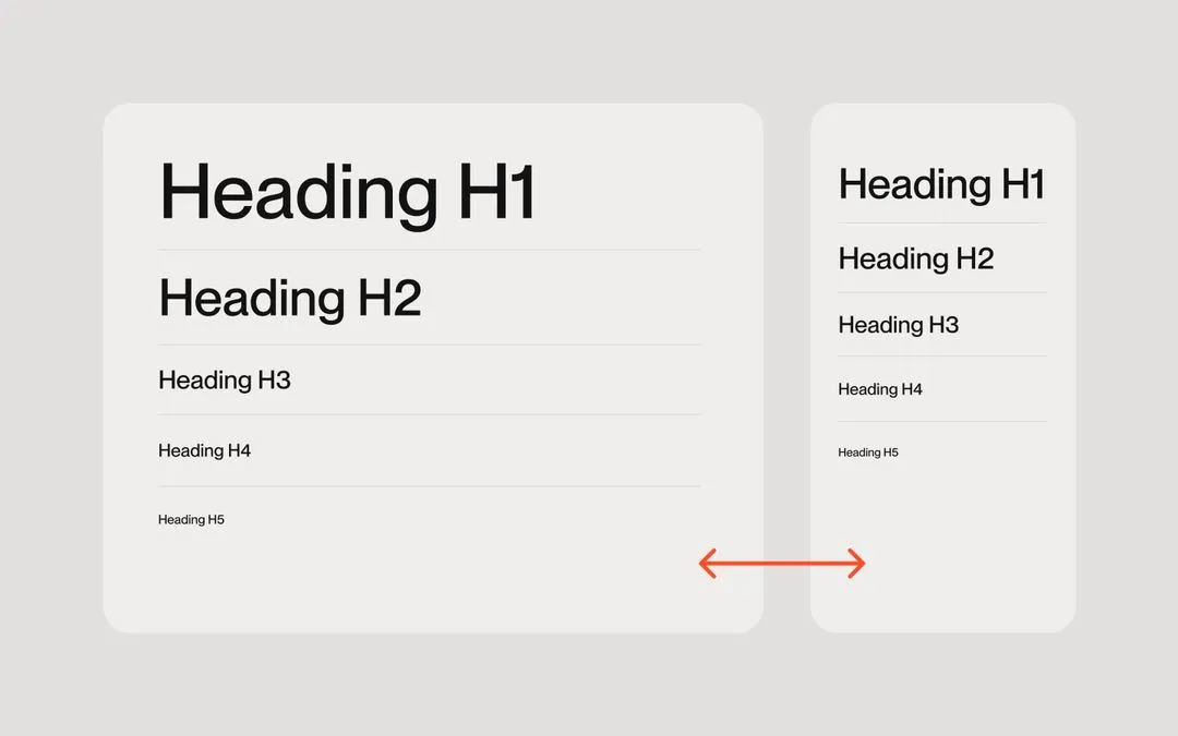
The system derives --size-font by dividing the clamped viewport width (--size-container) by the ratio of design width to base font size. Setting this on body font-size means all em and rem values across the page scale linearly with the viewport within each breakpoint's min/max range.
--size-unit
Set this to your body font-size in the Figma design file (no px). Typically 16. This is the reference size that all your em values are based on.
--size-container-ideal
Set this to the canvas width of your design file for each breakpoint (no px). For example: 1440 for desktop, 834 for tablet, 550 for mobile landscape, 390 for mobile portrait.
--size-container-max
Defines the maximum viewport width at which scaling stops growing. Beyond this point the layout stays at the max size. Adjust per breakpoint to control the upper scaling limit.
Container
Apply max-width: var(--size-container) to your wrapper element to constrain content to the scaled container width. Use the .medium and .small modifier classes (85% and 70%) for narrower content columns.
Usage
Once applied, use em units throughout your CSS for font sizes, padding, gaps, border-radius, and so on. Everything will scale proportionally as the viewport changes, matching your Figma design at the ideal breakpoint width.